Photoshop: skills task
L/o: To use and develop creative techniques in photoshop 03/11/22
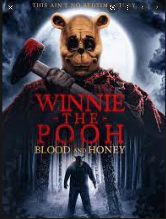
- A lot of horror movies use dark colours in their posters like black grey and red
- The title is normally in capitals and short
- The title is either in the middle or the bottom of the screen
- the credit block is at the bottom
- Somewhere mostly under the title is the release date and the directors name.
- the pictures in the poster show something in the film or a character in the film
- most of the posters include a face somewhere in the poster
- Almost all of the posters use shadowy colours or a dark colour palette ( black white grey and white)
- The title is in blocky fonts and is short.
my horror poster
colour palette: dark colours black grey red white
name:Taken ,we all get taken, no one left, don't leave
information in poster: name date released
ideas for images: unknown, aliens.
Ebi: the spots around the axe weren't there, you could see the house a bit more clear.


Comments
Post a Comment